This article is part of a series on choosing images for your website. A lot of people share with us that they feel overwhelmed when it comes to selecting images for their websites, but there are a few simple things to keep in mind that will go a long way towards simplifying the process. One area where people commonly get stuck is with hero images.
Tips for choosing a great hero image for your website
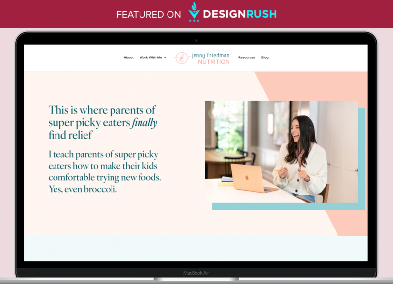
The hero section follows directly below the header of a website and it usually has a large background image, a heading, subheading, and often a call to action button. On your homepage this is what sets the tone of your site, so the image is important. But, it’s a delicate balance choosing an image that is strong but also one that won’t fight with the text you want to include in this section.
A wide image with a lot of white or neutral space in the middle works really well but if that doesn’t feel right for your brand you may want to consider overlaying a colour over a busier image and knocking back the image opacity or transparency so that the image is more subtle and your text stays strong and legible over a more unified colour. If you don’t have access to professional photo editing software you can use a free program like Canva to edit your images.
One thing to keep in mind when you are putting text over an image is the contrast between your font colour and the background. You should use a contrast checking tool (there are many of them if you google website accessibility and contrast checker – I use the WebAIM Contrast Checker) so that you can make sure you have enough contrast to keep your text legible and to keep your website up to accessibility standards.
If you have any questions about choosing images for your website send us a message – we can take a look at your unique challenges with you.