It’s not only what you say, but how you say it – and how your design delivers your message too.
How you present your information in a brochure, on a postcard, or on a website will determine if people read your material, and if they take you seriously. A good design makes it easy for people to follow your key messaging and act on your call to action. A poorly designed piece makes it difficult for people to understand your intent, challenging for them to stay focused, and in the end your expertise may be overshadowed by your poor choice of colour or a messy layout.
If your next marketing piece is going to be a DIY project, here are some professional graphic design tips to consider – simplified so that you can easily take your pieces from beginner to sophisticated.
Look at your piece from a distance and try blurring your eyes. What stands out in your design?
Hierarchy of Information
Use font sizes, font weights, colours, and positioning to build a strong hierarchy of information. Important information, like headings and call to actions, should be easy to spot immediately in your design. Look at your piece from a distance and try blurring your eyes. What stands out in your design? Are the most important elements the ones that you see first?
White Space
Give elements on the page breathing room. Give lines of text enough breathing room (leading) between lines. Make sure images, text blocks and other layout elements have enough white space around them so they are not competing for attention.
Colour
Choose 2-3 primary colours for your design. For a bold design choose contrasting colours. For a softer design choose more muted colours or colours closer to each other on the colour wheel. Avoid using colours that are so close that they appear to be a mistake. Avoid colour combinations that cause visual stress in a design (i.e. with green and red avoid using text of one colour over a background of the other, or having sections of colour next to each other in competing colours)
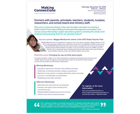
A marketing piece using contrasting colours
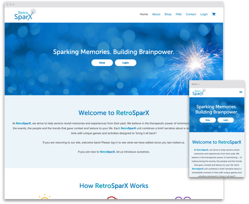
A website using similar colours
Graphics
Choose high resolution, clear and crisp images. Take photos in good lighting or use stock photos for your work. Some free stock photo sites include pexels and unsplash. For affordable paid stock photos check out istock or shutterstock for more options.
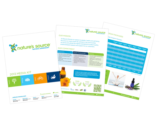
A marketing piece using font weight and colour variations to establish a strong visual hierarchy.
Fonts
Choose two fonts for your design. Make sure they are different enough that there is a significant contrast. Try a clean modern sans serif with a cursive script font, or a slab serif. Using two similar fonts may look like a mistake. Be intentional in the contrast. You can find free font options for your website and print projects at Google Fonts.
Font Weights
Within your chosen fonts play with font weights in a thoughtful way, to create a hierarchy of information. Use bolds, semibolds, and thin weights of a font to add contrast to headings, call to actions, and other text that needs to stand out from your body text. Make sure any thin fonts are large enough to ensure readability, and avoid using them for footnotes and other small text.
With this knowledge in hand, you have a few basic tips to apply to your next graphic design layout.
Rather pay a professional? Let’s jump on a call and we can prepare a no-obligation estimate for your project.