Let’s start off the new year with some trends to watch for this year.
Fact: Everyone has trend predictions for 2024… so why read ours? We didn’t just copy and paste generic predictions from other sources. We looked at the past year and what’s trending right now, and what will be most useful for you.
Colour Trends
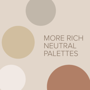
Last year we saw a lot of rich neutral palettes – lots of off-whites, terracotta, pinky beiges, and soft taupes.
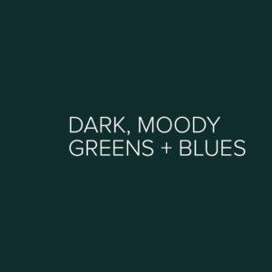
- 2024 will see more of these earthy rich neutrals with pops of accent colour. I noticed quite a few brands in the last half of 2023 using dark, moody greens in their palettes. I think 2024 will bring us more dark greens and also some darker blues (for people who like the moody trend but want to be ahead of the curve and not blend in too much).
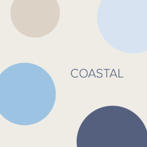
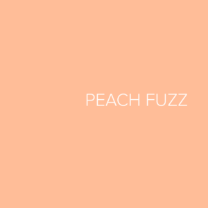
- Looking at the colour of the year for many paint companies, we are seeing medium coastal blues and of course Patone’s colour of the year, Peach Fuzz. These soft colours can add depth to neutral palettes or balance to deeper palettes.
Tip: Want your colour palette to be on trend but still stand out from the crowd? Look at a trend and figure out why you like it. Don’t use dark green just because everyone else is. Is it the richness you like? The contrast with lighter neutrals? If you can figure out why you like a trend, you can come up with a way to thoughtfully incorporate the same trend or the essence of the trend, within your own brand.
Font Trends
Fonts tend to become trendy, then overused, then dated fairly quickly. If you are using a font trend be mindful that your logo or brand may need a refresh sooner than if you choose something more classic or unique to your brand.
A few trends to watch for?
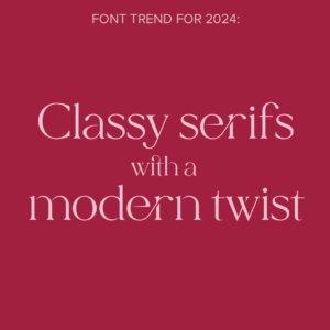
- Classy serifs with a modern twist – they picked up in popularity in 2023 but they are not going anywhere… yet! Choose one that is still readable (if it is too ornate it shouldn’t be used where readability is key)
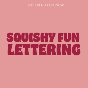
- Squishy fun lettering – fun brands will experiment with more graphic lettering (think distorted bubble letters from when we were kids)
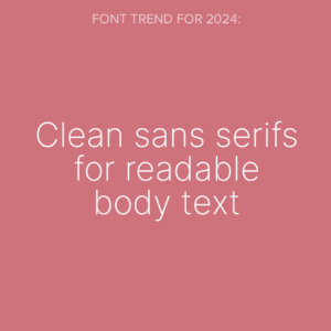
- Clean sans serifs for readable body text – with an emphasis on accessibility and ensuring that text serves its primary function of communicating, we will start to see a shift towards more thoughtful and accessible fonts for body text.
Tip: Play around with fonts but make sure your final text is legible. It is easy to push fonts too far at the expense of it being readable to your audience.
Layout Trends
- This year we will see more experimenting with AI leading to more layered and collage looks that are easier to create with AI.
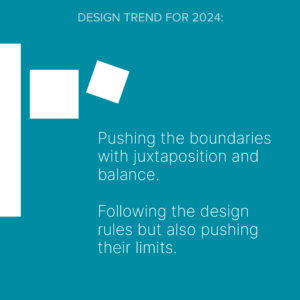
- We will also see more designs pushing the boundaries with juxtaposition and balance, following the design rules but also pushing their limits. This trend can be tricky since pushing things too far will make your layouts look amateur and the user experience will suffer. I’m interested to see what people do with this trend.
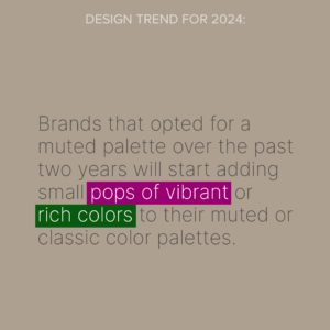
- Brands that opted for a muted palette over the past two years will start adding small pops of vibrant or rich colours to their muted or classic colour palettes. A pop of neon green, bright pink or royal blue can enhance a layout that previously used a muted palette and give it a little boost, without needing to completely rethink the palette.