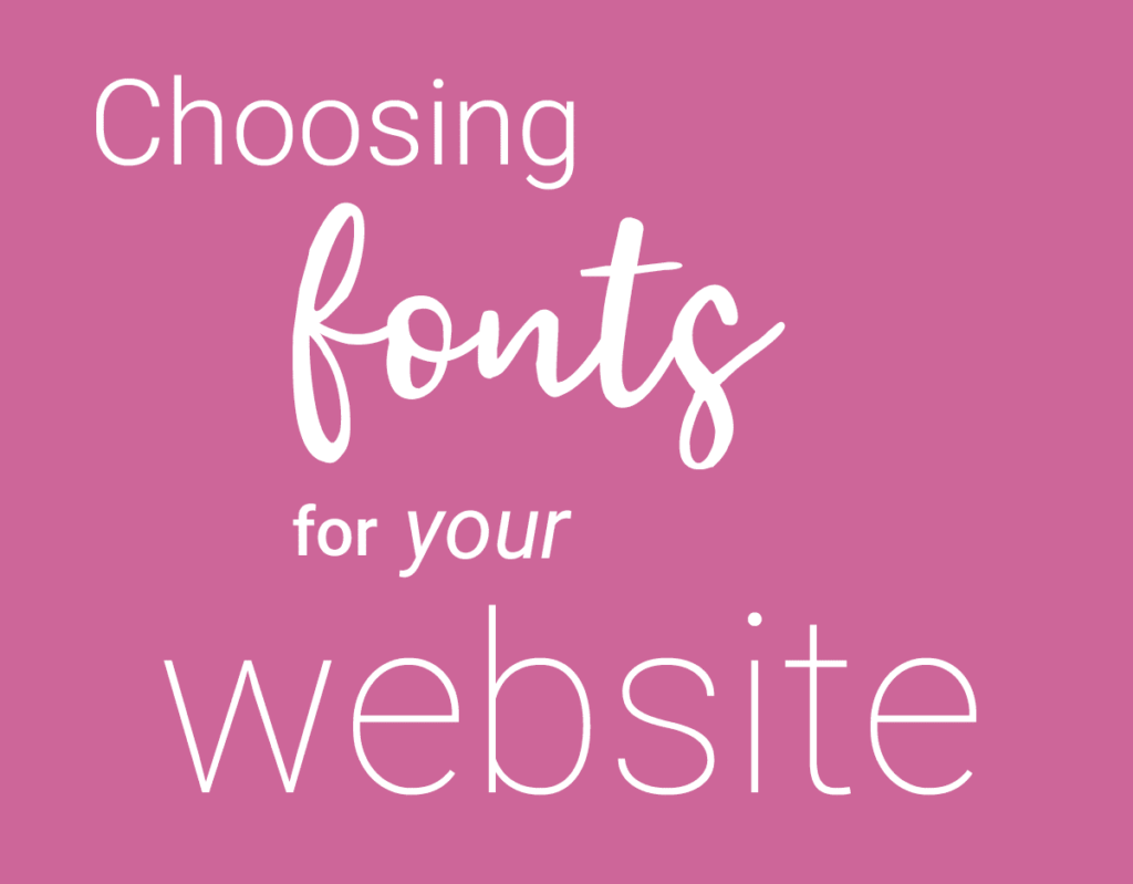
I LOVE fonts but I get it – there are a LOT of them out there and it can be a challenge choosing the right ones for your project. Your font should feel like it fits right in with your branding. The style of font you choose can make a big impact on the overall impression of your logo, marketing material, or website.
My tips for choosing the best fonts for your website:
1. Pay attention to the fonts on other websites.
You don’t want to copy other people, but knowing what fonts work, or don’t work, in real life scenarios can be tremendously valuable.
2. Stick with one or two fonts that compliment each other.
Any fonts you use should feel like they match your branding and go well with each other. They shouldn’t be so close in their visual appearance that it looks like a mistake.
3. Use variations in size and weight for interest.
Try to choose fonts that have a large variety of weights – light, regular, medium, semi-bold, bold, black. This gives you the opportunity to add emphasis and create interest without having to go outside of your chosen font family.
4. Make sure the fonts you are choosing are easy to read.
If you want to use a script font, use it for emphasis and not for key messaging that you want people to be able to read quickly. Keep in mind that some fonts work better for larger bodies of text and some work better for headings.
Struggling with finding the right font or font pairings for your website?
Reach out if you have any questions!