Do you remember back when it was on-trend to use light grey fonts on your website? It looked beautiful and was so minimalist and modern, but the only problem was that no one could read it.
We have come a long way in realizing our past font mistakes, but have you taken the time to make sure your fonts have enough contrast with the background colour to pass accessibility standards? If your fonts are too small or too light you are creating a huge accessibility barrier on your website and it is something super easy to fix.
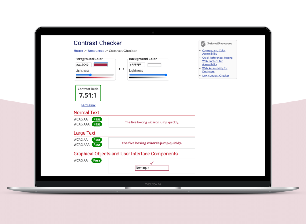
Do you have enough contrast between your font colour and background colour?
Designing with accessibility in mind is much easier and seamless than trying to weave accessibility into your website after the fact. If you haven’t thought much about accessibility before you are not alone, and it may seem overwhelming. But, there are small things you can do that go a long way towards making your website more accessible.
Where can you begin?
Use a contrast checking tool, like the one at webaim.org to make sure you have enough contrast to pass current accessibility standards. You can enter the hex code of your text colour and the background and it will automatically tell you if you pass or fail. And if you fail, adjust the colours until they pass and apply these changes to your website.
Pro tip: Make sure you are also checking the contrast on your buttons and links – in both the inactive and active state.
Small changes can go a long way in improving the accessibility of your website.
Questions?
Have any questions about improving the accessibility of your website or marketing materials? We are writing more resources on this important topic and would love to know your biggest challenges!